My Comprehensive Style Guide to the 2010 World Cup Uniforms (cont.)
The last group has been called The Group Of Death, this group is being called The Group of Life. For Italy of course.
Italy
Once against my bias plays into this. There are things I really like and things I really dislike. Like: The collar on the home shirt with the mix of the green, white and red. Dislike: Those stupid gold streaks that the gaudy Italians always insist on on the away shirt. Confused: Is that a six pack and pecks embedded on the home shirt? Also, shouldn't they have stars somewhere on their shirt? Anyway, regardless, I think this home shirt is one of the best of all the country's this tournament. I really like the collar.
Paraguay
I should point out that I can't find the away shirt anyway, if you can, can you please let me know? Thanks! Anyway, Adidas proves once again to be boring as all hell; this could easily be confused with a co-ed summer league shirt.
New Zealand
Um, remember when I said this group would be better than the last? I lied. So New Zealand's shirt looks like a golf shirt, or, something you get free in a box of beer. Not just boring, but offensively so. Stupid Nike.
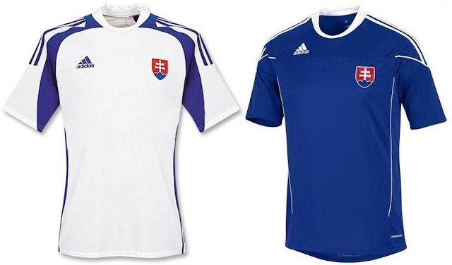
Slovakia
Ugh, Adidas! Do something different for once! I don't like shirts that are pretty much indistinguishable from other years; they're boring and not worth the ton of money they cost. Robbie once sang:
Rock 3 stripes
Not the Asics
A.D.I.D.A.S
Old school cos it's the best
Rob, you're so wrong.
Group E next, and will be halfway done.
Hopp,
scm.


No comments:
Post a Comment