My Comprehensive Style Guide to the 2010 World Cup Uniforms (cont.)
So far, I seem unimpressed with most shirts, and that's true. I mean, it's the fucking World Cup! Show some pride! Let's see if this group can do better.
The Netherlands
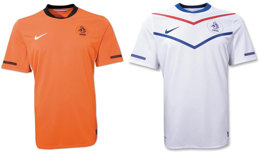
Well, this group is off to a bad start. They colours are orange and their symbol is a crazy looking lion, can't they do any better?! Once again, Nike has shipped out the standard template; no wonder why the Dutch are wearing their warm up jackets for the Panini pictures, I would be embarrassed too.
Denmark

First, I'm not 100% sure that that is the Danish away jersey. Second, their home shirt isn't too bad. I kinda dig the retro-y stripes, but I am still not won over by the collar. Honestly? I think they should all wear the Peter Schmeichel cir. 1992 keeper jersey. That would be stunning.
Japan

This is actually a pretty cool shirt, both home and away. I really like the colouring of the home shirt, and I like the not-so-but-kind-is cheesy claw marks on the away shirt. I also like the collars on both shirts; overall everything is neat, clean and pretty bad ass.
Cameroon

Holy shit, this is an awesome shirt. I realize the similarities to the Ivory Coast, but it's still pretty cool. I really like the lion motifs, both in the patches and within the shoulder design. Over all, this is one of my favourite shirt designs.
Halfway done, will continue this in a little bit. Please feel free to comment!
Hopp,
scm.
YES that is the second Denmark shirt...and you're gunna have to get used to the home jersey....cuz I JUST bought one OHHHH SNAP!
ReplyDelete...and keep up the great work...I'm loving the blog! :)